I'm getting really lazy on these blogposts. I'm so sorry ):
Accessibility: The accessibility for my page is fairly decent. I can always relink my pages back to the original page and get it what I want.
Transparency: With all the images that I have on the site, I think the general gist of the site is fairly transparent in it's goal.
Visuality: I tried adding videos and images into the site to help it not be so text dense.
Popular Designs/References to Current Culture (Kairos): The only page that I had popular references was the donation page and contact page which had links to facebook and other social networks.
Convenience: I think the convenience of the page needs work because it needs more images and maybe less text because no one would want to read through all of the text I had in it.
Personalization: I liked the color scheme I had going in the page. I think I'll keep the blue and orange theme, but change text font since people said the orange was a bit hard to read on the blue background.
Monday, April 14, 2014
Wednesday, April 9, 2014
4/7 Question of Categories...I'm seriously just doing all my late blog posts today to catch up
When we're talking the respectful remediation vs the radical remediation argumentative paper, I believe that we're striving toward the respectful remediation. The reason I think this is path we're going for is because we're not coming up with a whole new original thought. We're creating a new design that is based off of existing designs for a topic. Some of the small details of how we want the design to look like is up to us to be inventive, but to some degree the design has a similar pattern most websites that follow the same topic share. Along with the content. The argument is still made, the supporting reasoning is a large chunk of the page that will be the same regardless who does it and the there is a common ending statement made at the end. So in a nutshell: The re-invention of thanksgiving dinner and it's presentation may be different depending on the person, but the ingredients used to showcase thanksgiving (turkey, stuffing, potatoes, cranberries, etc.) is consistent minus differing techniques made to use it.
If it was a radical remediation then the content itself is different and has to add a new element to the dish. I don't know what specifically, but maybe new steps in preparing the meal or substituting the ingredients (content) of the page with something similar.
For my website, I want to try and make it less text based and more image and media based than I did for dreamweaver. Keeping the bare necessities to a minimum and adding as much media as I can and more interactivity.
3/31 Blog that is also late
Sexism is still a struggle and following under the domination of the patriarch is such a long standing system, it's hard to break away from it. Sure it's not as prevalent as it was back when there was a king and people were ruled under his power, but it's not gone. It still exists to some degrees. I have a friend that their mom works as a coach for swimming for many years and the ages she trains with show real progress and promise. She was soon replaced with a male younger than her, with little to no experience expecting advanced swimming techniques inappropriate for the age he was training and gained credit for all the people that my friends mom was technically responsible for training. The board that runs the program are mostly men and if not, women who are solely out to just enhance their child's training rather than the whole team.
Racism is another white elephant that we tend to just glaze over. We say we're over it and it's not around, but it's still there. People just don't want to admit it. One article I read was that a white child was shopping with her African American parents. But when confronted by shoppers and other people, they thought that the child was being kidnapped by the African Americans who happened to adopt a white child. Read the article, it's really interesting to post-modern racism that still exists today.
http://www.newsweek.com/what-adopting-white-girl-taught-one-black-family-77335
What I've noticed about the technologies of today in regards to racism, colonialism, and sexism is that people are more freely opinionated on the internet. People are more inclined to speak their mind when dueling an anonymous account and not being accountable for the actions they make online and offline. Though there are ways of tracing IP addresses to comments that are more offensive than others, it doesn't hinder the fact that people are still more inclined to post their opinion more vocally and freely than they would in person. The accountability is lowered since people can't trace a face to the person and doesn't count as direct conflict.
In shows like "What if?" where scenarios are set up with actors to get local people in the area to react and see if they would stop a situation, the actors sometimes touch on the subject of racism and sexism if the role of the person stealing a bike was a African American man or a White guy or White Woman. People do react in different ways.
4/4 Post that is late
Here are the blogs I commented on: In case you might not find them since some didn't have theirs up
(I just had to redo them because I forgot that I need to authenticate by typing in the weird "T4CHD4" image they do, so it didn't save my comments.
Russ Walsh
- I enjoyed the concentration on cats because cats are the best and internet + cats = match made in heaven. I think the design is very appropriate to the audience since it's simplistic and it's only three different bars they need to keep track of. I know that it's meant for old people and I could only say that maybe you could expand beyond cats theme since I think the cats for old people is a very VERY specific group within older people, but since you already clarified that it's CATS for old people, you already had your heart set out for the theme. So I won't argue there.
Elements in general that websites like these emphasize on is accessibility to everyone. Simplistic design in which symbols and images represent a category to focus on. And since this audience was targeted toward old people, there really is no need for a social media sharing option since that's geared toward a younger audience more aware and accustomed to be hyper interactive.
Well done!
Wyatt Nunn
I can't remember if your group was meant for the old people or young children or if it there was a group for young children. So it was slightly confusing remembering the audience that this interface was meant for. The plus symbol I assume is for "LifeAlert", so I guess that counts as the indicator it's the audience of old people. I like the organization of the symbols even though it's a tad long and I don't think that old people would need that many options. I couldn't tell at first what the "N" symbol was for, but I guessed it was for news since so many people included that. The only thing I'd kinda like to see in this is using more texts and words to help label which button does what. It's a lot to assume that the older generation is going to know what each symbol means, so I think that would be beneficial to them.
Elements in general that websites like these emphasize on is accessibility to everyone. Simplistic design in which symbols and images represent a category to focus on. And since this audience was targeted toward old people, there really is no need for a social media sharing option since that's geared toward a younger audience more aware and accustomed to be hyper interactive. I think giving more options and accessibility to the viewer helps entice the audience to the interface as well.
Next Big Thing
Video games have taken players through an empathetic role and play through the model in a set of constricting rules. Taking these basic features of a video game and changing the medium has developed a new way of connecting the player to the videogame. From the Atari analog stick to the touch/duel screen consoles of today, videogames are pushing the limits of interaction with these worlds.
The remediation of this model is a radical step in videogame technology: The Oculus Rift.
This device allows the player to physically and visually experience the point of view of a game on the screen. The direct connection allows the player to feel more involved in the world they are placed in.
http://www.oculusvr.com/

The Oculus is a 3D environment where the player puts on goggles and takes the idea of "First Person Point of View" to a whole new level.

The original medium this game type was featured on was a game console that was plugged into a TV or screening device that the player would visually view in front of them. The audience was meant mostly for the gaming community that was interested in technology and playing the role of another character and be able to do things that couldn't in real life. This still holds true to the existing community of gamers today. This console is the new game type because it remodels how we physically view our games. We now are in the place of the game. It also limits the perspective of the game by being solely in first person. This is the next big thing because even though this is being tested in video games, it can be used in society for other reasons as long as we don't get into a post apocalyptic world like Gamer. Power to the Player.

The remediation of this model is a radical step in videogame technology: The Oculus Rift.
This device allows the player to physically and visually experience the point of view of a game on the screen. The direct connection allows the player to feel more involved in the world they are placed in.
http://www.oculusvr.com/
The Oculus is a 3D environment where the player puts on goggles and takes the idea of "First Person Point of View" to a whole new level.
The original medium this game type was featured on was a game console that was plugged into a TV or screening device that the player would visually view in front of them. The audience was meant mostly for the gaming community that was interested in technology and playing the role of another character and be able to do things that couldn't in real life. This still holds true to the existing community of gamers today. This console is the new game type because it remodels how we physically view our games. We now are in the place of the game. It also limits the perspective of the game by being solely in first person. This is the next big thing because even though this is being tested in video games, it can be used in society for other reasons as long as we don't get into a post apocalyptic world like Gamer. Power to the Player.
Friday, April 4, 2014
Wednesday Blog I forgot about...Oops
This is the the Elderly Tablet. Simple and provides the necessities in life for all their needs. Icons are fairly simple and LifeAlert is a must have for any adult. News, weather, photos are included apps that will help stay connected to the world. Contacts allows them to stay connected to family and they can talk to their family through this device and their phone.
Sunday, March 23, 2014
Reflection 1: Basic of the Basics
A Webpage
Some of the text in the coding is the same. Such as it saying "This is my webpage!" and "It's my conclusion". Mostly things in brackets and single letters will not show up in the page visually because that is the coding that is telling how the page will look and the text is the content that will be visually displayed.
Things that don't show up in the page.
"<h1>" is for the header. "<b>" is for bolding text. "<p>" is the page break. "<body>" unifies all the stuff into a single page.
The reason that it didn't show up as that because the coding to do that wasn't there. That is what the <br> is for. It's a single line break. If you want to have the page staggering. You need to tell the coding to do that.
In your editing program, delete </h1> from that second line of text. Save the file and refresh your browser window. In your blog, explained what happened when you deleted this element.
In what ways does the web page resemble the code you've written? What is visible in the browser? What is not visible? Why do you think the sentence "I am testing a lot of formatting things out with it" didn't display staggered like it did in the code?
Some of the text in the coding is the same. Such as it saying "This is my webpage!" and "It's my conclusion". Mostly things in brackets and single letters will not show up in the page visually because that is the coding that is telling how the page will look and the text is the content that will be visually displayed.
Things that don't show up in the page.
"<h1>" is for the header. "<b>" is for bolding text. "<p>" is the page break. "<body>" unifies all the stuff into a single page.
The reason that it didn't show up as that because the coding to do that wasn't there. That is what the <br> is for. It's a single line break. If you want to have the page staggering. You need to tell the coding to do that.
In your editing program, delete </h1> from that second line of text. Save the file and refresh your browser window. In your blog, explained what happened when you deleted this element.
--> The text from "This is my webpage" down to "Like spacing" was all bolded. The backslash ("/") tells the command to stop here. Thus since there was no "</h1>, the coding didn't know when the header format was suppose to stop until the next <h2> appeared.
A Better Webpage
The page itself is more filled and generally looks the same. The only difference is that there is an external link to a video posted in the page. So that's a nice touch: Plus if it's cats on the internet. I've seen it for sure. Simon's Cat is hilarious.
Things that can be added is color and formatting and more visual things, but that requires advanced knowledge of coding, which I have basic coding knowledge sorta.
Pretty Webpage
The commands to <carrot> and </carrot> something still applies since only certain parts of the page are getting these visuals.
I believe the stuff in the {brackets} do the same as well, minus having to use a backslash to stop a command. It simply needs to fit within the brackets I think.
Compare, Contrast
Based on looking at the coding in dreamweaver, the coding is relatively similar except they have css that builds the coloring of the text into the content and images are derived and found in the location of where the image is stored. Also, the stuff that isn't going to be visually shown ranges from the blue text AND green text now.
Friday, March 14, 2014
I think I did okay?
Susan Cannarella
March 12th, 2013
DTC 355
Self Reflection
This project
overall was very fun and I enjoyed learning how to make a website through
dreamweaver. Though I didn’t have any experience with the program itself I
surprised how intricate and thoughtful designers have to be when it comes to
making a website based on the client, the audience, the choices in layout,
color, images, and how a page flows with the rest of the topic. Choosing the
Animal Rights topic, I came in knowing what I didn’t want. The ethos that I was
not trying to carry was the idea that animals should be a guilt trip to make
the audience feel the need to adopt or involve their time with helping these
animals. I wanted the ethos to be a soft and caring look, which tied into the
colors. I didn’t want to use the color black because the color evoked a dark
and seriousness to the layout of the page. I wanted to colors to be warm and
inviting. Not to mention I was trying to make the page more approachable. The
ethos that I wanted to create was making the audience/viewer feel empowered and
see the good in humanity when people help one another and those in need. That’s
why I wanted to put the videos in the “News” page because it helped visually,
emotionally, and use audio to sway the viewer.
The videos that I
used to capture the audiences attention was videos of an organization that goes
around answering calls of abandoned lost animals that need rescuing and show
the rescue and the recovery. It’s a warm touching feeling that makes the viewer
feel redeemed in humanity and their acts of kindness. This is pathos I used to
help pull on the heart strings of the viewer because audio of the soft sad music
sets the tone of the story and watching the animals with their sad faces and
shaking body makes the viewer sympathetic.
The reason I put
so many images of animals, pictures of people with animals, videos of animal
rescues because it breaks up the page layout. If I had no images or videos, the
website would be very text heavy. People in this day and age are visual
learners and look for compressing information into smaller ways of
communicating. Images are universal and they can be communicated by assumption
of the viewer recognizing the image. It’s colorful and allows the viewer to get
a break of reading through text. This is also the reason why I chose to do an
Infograph style explanation of the “No Kill Mission” page. It breaks up the
information to get the same message across, but through a new way. I added
videos into the pages because it makes the site more engaging and interactive
with the viewer so they just have to sit and listen to the story unfold with
Hope for Paws.
As for the spatial
mode, I tried keep the text to the left hand side and made images and videos
centered in the front of the page so the audience knew that that was the most
important part of the page. I would’ve tried fitting the image of the dog and
owner from the success story onto the side of the text like a news article, but
I decided against it mostly because I didn’t know how to change the placing of
the text. The pages were all driven vertically since you can only move so far
horizontally across the page. But I made “----“ lines to break up the topics in
each page.
The only different
shape that I messed around with was the logo. It is in the top corner of the
front page and I realize now that I should’ve had that image on every page in
the corner to create cohesion and unison to connect all the pages together. The
logo itself is the symbolize dogs and cats as being opposites, but both needing
the equal amount of care and attention to help them achieve a safe home where
they won’t be put down in a shelter. I kept the color scheme of blue and orange
consistent in the image when the heart was place in the center, focusing on
love. I tried keeping the links to the pages in the same spot and keeping the
home page always at the top.
My
site is mainly linked to Bestfriends.org and Whitman County Humane Society. The
reason I chose these two sites to link my site with it is because they share
the same mission: No Kill, which states that animals that come to the shelter
in need of help will not be put down if they can’t find a home. The organization
strives to find alternative homes for the animals to live in and nurse them
back to health if they are injured or abandoned. Specifically I added Whitman
County Humane Society to the list because it is local and there is a sense of
community awareness for the audience to recognize when they can be personally
involved in the organizations events when it is so close to home. The reason I
chose Best Friends because they showcase the different options of being
involved and what the money the community donates to them will be used for. In
the Best Friends website, they have built sanctuaries and publically announce
different events and success stories of animals that have been part of the
program. By tying these sites into my site, it enhances the message of No Kill
Mission by allowing the viewer to see that there are more and more
organizations that are switching to the No Kill Mission and that they can
possibly get involved with their local Humane Society if they look around.
One
of the more unique ways that I used my website to become more interactive and
involved with the user is that when I was adding the donation page, the drop
down menu can actually come down and the user can actually page down through
the states and type in their information to donate money to the cause. I didn’t
actually intend for the links to continue to work, but it was a more of happy
accident that came around. The use of the interactive button helps enhance the
page because even though this is just a test page that isn’t meant for the
public, this stood out the most to the audience because the three people that
reviewed my site all mentioned the donation button and how it was really cool
that they could donate to the cause using those options.
I
didn’t realize until now, but one of the comments had mentioned that the pages
become really long and I should’ve added hyperlinks, so the user can scroll
back up to the top of the page, I would have done that if I had saw it before I
turned in the paper. I wish the video links had shown up on the site, but
having the hyperlinks to the videos on the page was about as good as it gets
and it still elevates the element of interaction with the user.
The
most effective part of my site that used rhetorically was through visuals and
the different types of visuals I used. I tried including color to the text so
it didn’t become boring. The orange color was supposed to be noticed and read.
The images that break up the page versus the videos that have sound and
animation added to them to make the piece more engaging helped bring more of
the visual quality and simplicity to the page. The use of the “donation” page
also allowed the user to become more interactive with the piece and engage in
the site fully so they can actually participate in the cause. The only thing I
could add would the use of audio perhaps.
I
really enjoyed the website building, but I just wish that I knew more about the
program to make my site look more professional and appealing to the eye. I feel
strong in the content that I produced, but I know that there are elements that
I can improve on.
Wednesday, March 12, 2014

Monday, March 10, 2014
Ethos I completely spaced on
So for the ethos of this website, it's not meant to show animals beaten and hurt and how awful humans are and guilt the audience into donating a dollar because the site makes them feel obligated to.
The website is suppose to be cheerful to some degree and make people want to help because of the things that are being done by the organization.
Their money will have purpose and they can see the results it leads to whether it's success stories or a video of how an animal is transformed from the kindness of others.
I really don't know what else I'm presenting here in regards to ethos other than that. But I guess we'll see.
I guess the coloring is suppose to be warm and inviting. So that makes the site more approachable.
Needed to remove the color markers I left in the corner, so I will go back and fix that tonight.
Wednesday, March 5, 2014
Website So Far


Content and review will be added later today
It's later today, but still today.
So what I'm working on is getting the content in the pages first. Hopefully by Friday the only thing I have to worry about is getting the layout done because I have no idea how to change the the font color for specific parts, make some of the images centered in the page, add that video into the news page since it wasn't working today and get decorating the background and colors to look cleaner.
Today has been a long day and I just got out of animation at 10pm. So I'll do what I can since tomorrow I also have a 12 hour day as well.
Monday, March 3, 2014
Oh god am I ready?
How well do you understand the subject you're talking about? Or, put another way, how much research have you done on your topic?
3: There is always room for improvement, but I believe that I have a pretty good grasp on what I'm talking about and the content that I want to present in the website.
How much have you planned the way you'll present information/make your argument?
2: As it says, I've done some planning, but I haven't started anything until now. I have all the material I need to make my argument, but I just haven't started until now.
How much have you planned the visual design of your site?
3: I have all the images I know I need and if I don't I know where to find them. I have the color scheme planned and have already incorporated that in the project. And the image of the logo is up.
How much have you planned your site's structure/organization (pages and content)?
3: I have the links that I want to be the focus of the page and I new that for the "No Kill Mission" it's going to be very visually orientated.
How many assets have you gathered? (See Writer/Designer, chapter 4)
2: I think I have enough assets to get me through the project, but I could always use more.
After today's worktime, do you think you would be able to finish a complete draft of your site by Friday? By Monday?
--> I've been busy with Student Manager Training, Outside paining and animation I need to work on, Phi Sigma Pi business with events, planning, marketing, and work at Northside that makes it difficult for me to schedule time to work on the website outside of class. Not to mention I don't own Dreamweaver and Expressions is a PC application only. I know I can finish the website by Friday probably, but I don't think it will look as nice as I would want it.
Friday, February 28, 2014
Summing It All Up
Using lines, shapes, and colors make a significant difference because the text is different sizes and shapes which draws the viewers attention to think that the larger the shape, the more important it is. It allows the user to be more creative and inventive on presenting information to a viewer. Being able to connect shapes and lines together also conveys an idea or connection without saying words. Take for example a picture of a square and Spongebob; connect a line between them and the viewer is forced to connect the two shapes and images together and associate them through indexical signs. It's implied that a square is the same shape of spongebob, so it becomes an implied connection or association.
Based on the Rhetoric of being able to draw in/insert images opened up the rest of the users to go and find images to post something in. I will say the idea of following the prompt completely flew out the window and no one really paid any attention to the lesson after that. It became a race to see how much they could post in the doc while remaining anonymous. People feel more comfortable being able to say or do things when there doesn't have to be a name associated with them. So in this case, being able to paste images or words that you wouldn't normally show in a classroom or bring up in a classroom became more accessible and acceptable to post it since it can't be traced back to you potentially. Another example of how we're influenced by the rhetoric, some people were posting meme's about patrick and that prompted another person to make quotes that Patrick makes.
For most of the time I remained silent and I was slightly annoyed that as a teacher, they were completely ignored by his students because people were messing around on the drawing and not even paying attention. I know that using a format where everyone can edit and insert images is pretty much asking for it, but completely ignoring the topic and fueling the fire did made me angry how they were slightly disrespectful to the teacher. So that made me not participate in adding meme's and writing random stuff because I was trying to pay attention to the teacher. Every once and awhile I tried deleting the non-sense to keep people on task and slightly focused, but that didn't really work so I gave up and ignored most of it.
If we're using information for academic purposes and counting CREDIBLE sources we don't use wikipedia because it can be changed by the public based on voting and influence. This goes for the collaborative work we did just now because people will post random wiggling people or cats in space and there is no credibility or anyone owning up to their actions. It's based on anonymous actions that can't be traced or counted as credible. Not to mention it's easy to read and track when the content and page doesn't keep constantly changing. Using this type of tool is good for brainstorming and sharing ideas to get the "academic juices flowing", but it shouldn't be something that is cited, sourced, and turned in for a a dissertation or such.
Wednesday, February 26, 2014
Meme's FTW!
So for today we're making meme's based on Althusser's passages that confuse us.
Ramsey's Confusing Passage: "What distinguishes the ISAs from the (repressive) state apparatus is the following basic difference: the repressive state apparatus functions "by violence" whereas the ideological state apparatuses function "by ideology".
.jpg)

Ramsey's Confusing Passage: "What distinguishes the ISAs from the (repressive) state apparatus is the following basic difference: the repressive state apparatus functions "by violence" whereas the ideological state apparatuses function "by ideology".
I decided to make this cute little meme based on Philosoraptor. I'm not really sure why I wanted it to say that exactly, but to touch again on what your passage says, that there are two apparatus that function together and help fuel one another. Without ideology, there wouldn't be repression and violence. And without violence, there wouldn't be people that strive for the ideological. The ideological is just an image of a utopian state that can never be achieved, but people still try and work towards.
Shens Confusing Passage: "To my knowledge, no class can hold State power over a long period without at the same time exercising it's hegemony over and in the State Ideological Apparatuses"
Here is "Y U NO" rage face. I chose this one because there is no way that you can hold an ideological state apparatus. Think of any group that supports one thing; there is always another group that will fight against those beliefs and choose to repress and argue the standpoint. Take for example the government and our senators. We elect them and they will stay in power as long as we vote for it. If we don't like them, there will be groups that will try and discredit them and if enough people agree with them, their "State power" is taken away. Dictators can rule their country through fear and violence, but there will always be a resistance and total control will never be possible.
Tuesday, February 25, 2014
Interpreting the Ideological and Repressive
Based on the reading, "But now for what is essential. What distinguishes the ISAs from the (repressive) State Apparatus is the following basic difference: the Repressive State Apparatus functions "by violence", whereas the Ideological State Apparatuses function "by ideology" (80). In this passage he is talking about how the two distinguish themselves between each other. The Repressive sets rules that repress the ideological. For example the Agents and Potential Agents. The Potential Agents don't have set limits and since they aren't the ruling class, they test the boundaries and limits until the ruling class (Repressive) comes in and sets in limits to what they can and can't do.
The one that I'm not quite sure about is "In the same way, but inversely, it is essential to say that for their part the Ideological State Apparatuses function massively and predominantly by ideology, but they also function secondarily by repression, even if ultimately, but only ultimately, this is very attenuated and concealed, even symbolic. (There is no such thing as a purely ideological apparatus). Thus schools and Churches use suitable methods of punishment, expulsion, selection, etc., to "discipline" not only their shepherds, but also their flocks. The same is true of the Family....The same is true of the cultural IS apparatus (censorship, among other things, ) etc." (81). I think it's talking about that there is no way we can truly have it one state of being because there will always be someone or something out there that will counter or fight the ideological state. If there is a dictator, they can try and rule in fear and violence all they want to stop uprisings against them, but that won't stop everyone. There will always be a group somewhere that will rebel against them, which is why we have laws and institutions to keep the ideological more realistic.
Responding to another's post will get done after I get back from work.
Ramsey's Post: What distinguishes the ISAs from the (repressive) state apparatus is the following basic difference: the repressive state apparatus functions "by violence" whereas the ideological state apparatuses function "by ideology
I'm back from work at like 10pm, so here we go to finish it. This is exactly what I was talking about. You are correct that the Repressive (not Representative) is an acting class of power (government as you say) that uses violence to repress the lower classes (private companies as you use in your example)
Shen's Post: ""To my knowledge, no class can hold State power over a long period without at the same time exercising its hegemony over and in the State Ideological Apparatuses" (Althusser 81)"
I had to look up the word "Hegemony" because the whole statement threw me off without knowing what it meant since the rest of the statement makes comparisons to hegemony. Hegemony is an indirect form of government which uses connections to imply their power and control through fear and threats of violence. What I think Althusser is trying to say is that no class can hold overall power by ruling with fear and threats while under the impression this is the ideological state they want to keep their status. Ideologically, one would be ruling in power based on the loyalty of their people based on trust not through a threatening power repressing them in fear to keep control.
Wednesday, February 19, 2014
Plagiarism or Not?

It wouldn't just let me save the file onto my desktop, so I had to screen shot the image onto my computer. So if there is any discrepancy, let me know and I can give you an alternative. I posted the url for the image if you need it.
This image would be used in the part of showing what the money people donate will go towards. Specifically this money will go towards new habitats that are open for the animals, as animal sanctuaries.
Here is a link to a video where this lady made her whole estate a cat sanctuary. Enjoy the cats.
Here is the URL: http://www.flickr.com/photos/30447586@N00/2171312700/in/photolist-4iSxBS-4pEKd7-4zTASm-4VoiFG-53zkrK-5bbLYZ-5bA43V-5fjtBM-5oWSBZ-5EBXmP-5SCo9Z-5WuReR-5ZUdK7-65G7TK-69489U-6iDNFS-6iDNGm-6q8C3n-6r9Vxp-6C58Ea-6F4MfX-6GUuPY-6MBEaE-78N3MV-7c7WvG-7cPQJL-7eER9p-7gp7ed-egN6qu-egGjiF-7yrNCC-js9BGb-7BksTc-baAvSR-baAvmM-9rKxQa-9YoGVQ-8KsKLr-baAveV-baAv5k-dhU9RW-caMz31-d4ouN3-dUtpsb-h5o3ka-aPvMSF-7EE5Zr-7EE6Ep-83vpaP-97uBZ7-e3AcY7
Friday, February 14, 2014
Valentines Day Norms!
The culture of Valentines has roles and restrictions depending on the age and the gender of the person.
Children (+7-14): At this stage, I hope kids don't have a relationship right now because....yeah, way too young. In elementary classes at the very least, they play the role of the giver and the receiver when it comes to valentines day customs. Kids hand out their pre-made cards they worked on the last couple days and the overall goal becomes gaining the most cards or favoring the people that stick candy to their cards.
For adult women: Often we're charged as the receiver. We're not expected to reciprocate the gift giving. I mean, if you're in a relationship, you should WANT to give your partner/spouse/whatever something special. Not out of obligation because we expect them to get something or because we feel bad they got us something if we didn't want it and we have to pay them back. It should be because we WANT to.
* I'm sorry. she looks a little mental in this picture...

For adult men: There are stereotypical traditions that men must follow on this very Red and Pink day. Chocolates, Flowers, and a Card is the holy trinity of a valentines gift. 1800flowers.com advertises hard on their part to sell sell sell the bouquet of flowers as much as they can. Variations include a teddy bears or other stuffed animals.

Children (+7-14): At this stage, I hope kids don't have a relationship right now because....yeah, way too young. In elementary classes at the very least, they play the role of the giver and the receiver when it comes to valentines day customs. Kids hand out their pre-made cards they worked on the last couple days and the overall goal becomes gaining the most cards or favoring the people that stick candy to their cards.
For adult women: Often we're charged as the receiver. We're not expected to reciprocate the gift giving. I mean, if you're in a relationship, you should WANT to give your partner/spouse/whatever something special. Not out of obligation because we expect them to get something or because we feel bad they got us something if we didn't want it and we have to pay them back. It should be because we WANT to.
* I'm sorry. she looks a little mental in this picture...
For adult men: There are stereotypical traditions that men must follow on this very Red and Pink day. Chocolates, Flowers, and a Card is the holy trinity of a valentines gift. 1800flowers.com advertises hard on their part to sell sell sell the bouquet of flowers as much as they can. Variations include a teddy bears or other stuffed animals.
The mere day sparks a frenzy of mixed feelings and shopping among those that choose to participate. The rhetors expect that there will be gifts, food, dressing up, and time spent with your significant other. It's what our culture has been accustomed to expecting those rules.
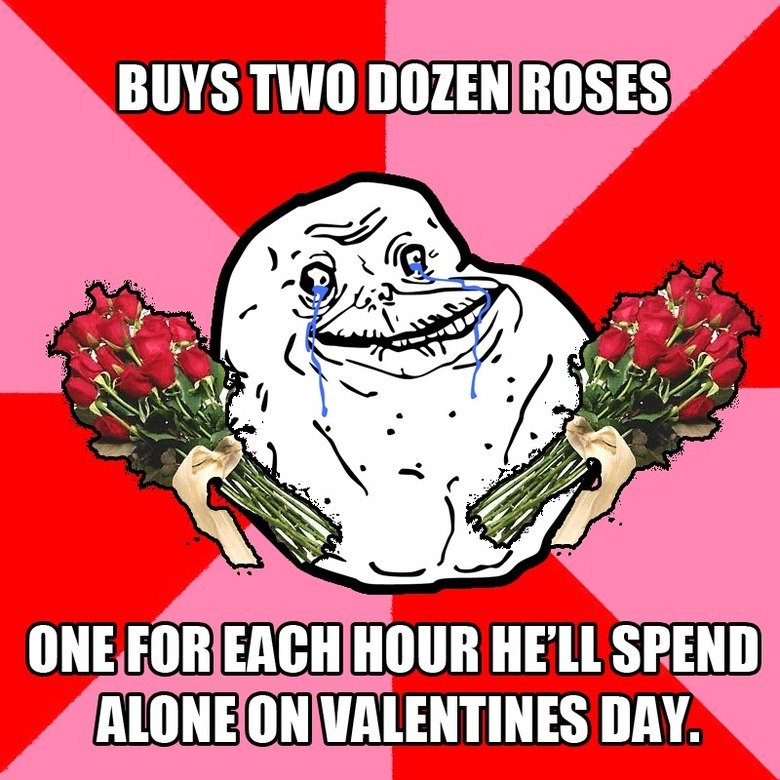
On the flip side, what are the roles of those that don't have that special someone. There are those to choose to bash and hate a day that excludes them. Personally, you make what you can of the day. You don't need a special someone. Sometimes it's the personal accomplishments that make the day just as special. Everyone chooses to react to the day in different ways. Some will spend it with friends and have an "Anti-Valentines Day" out of spite of the day to bring a sense of community among one another, some find different definitions of Valentines Days and celebrate it with people they love. And there are some people that make the day no different from any other day.
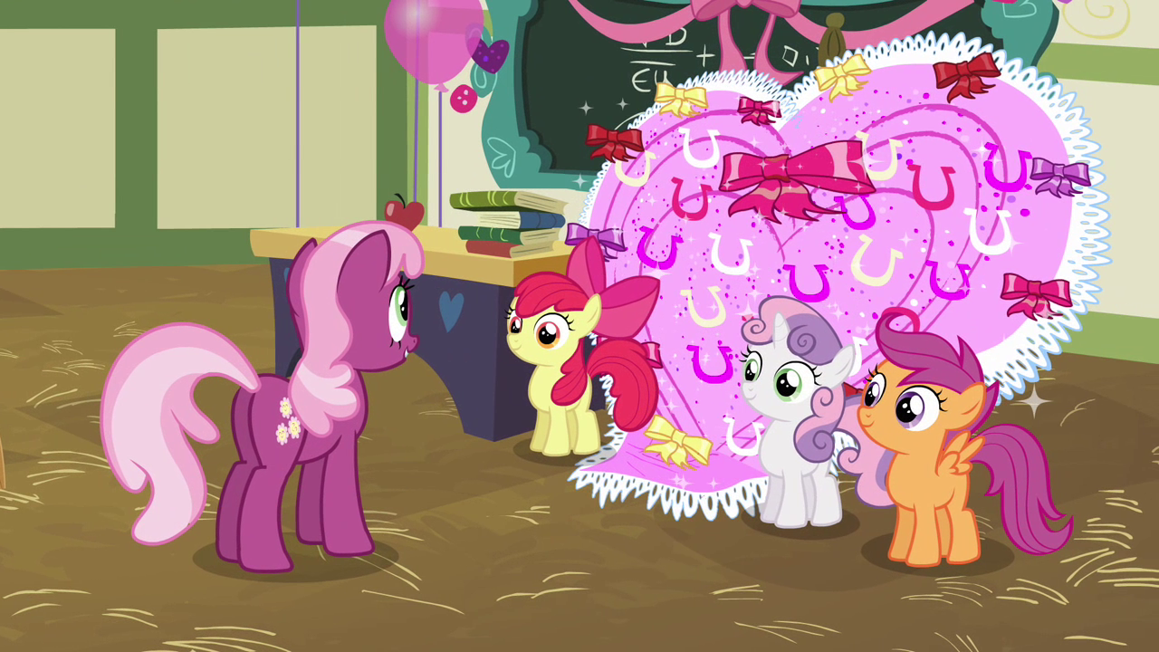
There is no WRONG or RIGHT in Hearts and Hooves Day (My Little Pony Reference: Don't shoot me).
No one said that if you don't do "this, this, and that" then you're not "doing Valentines Day right". There isn't a criteria that you must check off to make "Valentines Day Complete". There is simply doing. Maybe not even that. Customs usually entail the couples and people that are in a relationship to go crazy with the chocolate, gifts, and dinner reservations or romantic ambiance, but I think it can be interpreted up to the person. People make what they want of the day. No one has dictated that the person you celebrate it with is someone you're in love with and want an intimate relationship with.
Facebook posts have people celebrating Valentines Day for losing weight (loving yourself), shout outs to the family and friends that support them (Love between friends and family), glad with where they are in life (loving the decision they make and being happy with what they're doing with their life), or the cliche loving your special person.
I would agree with the idea that it doesn't exist until we, as rhetors, decide what it should look like because people make what the want to make the day in their eyes. It doesn't have to be less special based on mentality, but there are people that CHOOSE to make it a horrifying day where they image themselves:
I strongly believe mentality and attitude determines how to respond to a situation. If people choose to wallow in self pity, gush to everyone about their new bf, keep it romantic and private, or spend it with friends: then that's up to them.
Monday, February 10, 2014
Finalizing Plans for the Site
For the past week or so, we’ve gone over the fact that we’re
creating a website concentrating on social problems that face society. My
social problem/topic that I decided to tackle is Animal Rights. The site is supposed to inform communities of the injustices that animals go through and that there is a way for them to help. Be it through donation, volunteering, or adopting. The main focus is on bringing awareness and adoption is just a subtopic that is within the social problem that can be the solution.
The reason I chose this topic specifically is because I love animals. I want to be known as the “Crazy Cat Lady” that got married; breaking the stereotype and meeting the stereotype at the same time. Animals give us comfort and may take work, but they are family and many animals need homes where they can live in a stable healthy environment. they don't talk back to you and are that ear that sometime people need when no one is around. They don't judge. They're just friends.
The reason I chose this topic specifically is because I love animals. I want to be known as the “Crazy Cat Lady” that got married; breaking the stereotype and meeting the stereotype at the same time. Animals give us comfort and may take work, but they are family and many animals need homes where they can live in a stable healthy environment. they don't talk back to you and are that ear that sometime people need when no one is around. They don't judge. They're just friends.
I won’t post abused animals on the page because I want to
have some class in my website. It’s tasteless, effective, but I don’t want to
guilt trip the community to donate for animals based around graphic images. I
want them to see where their efforts will take them with happy images of
kittens and shelters that are being built. This way they know what their money
is going towards.
Example: Videos like these would be appropriate because it has a happy ending and gives the fuzzies.
And make you feel like this...

I like www.bestfriends.org how there are three very decisive choices to get involved. “Donate, Volunteer, and Adopt”. It’s decisive and clear about what the community can do to help.
 But one thing that has become very popular is Infographs. This
is an age in which current and future generations will share information
through visual images. It is a universal language that people everywhere can
communicate with and becomes visually pleasing to look at. The viewer doesn’t
become over-saturated in massive amounts of text to the point where they won’t
want to read it. www.bestfriends.org “No
Kill Mission” information/about page show their history in an infographic way.
But one thing that has become very popular is Infographs. This
is an age in which current and future generations will share information
through visual images. It is a universal language that people everywhere can
communicate with and becomes visually pleasing to look at. The viewer doesn’t
become over-saturated in massive amounts of text to the point where they won’t
want to read it. www.bestfriends.org “No
Kill Mission” information/about page show their history in an infographic way. Example: Geeks vs Nerds
Its informative, but visually pleasing to the eye -->
Sunday, February 9, 2014
Common Topics
http://www.hopeforpaws.org/
http://bestfriends.org/
http://www.pawschicago.org/
https://www.mercyforanimals.org/
http://www.paws.org/adoptions.html
These sites are a mixture between Animal Rights and Animal Adoption because at this point I'm trying to decided which direction I'm swayed to. I originally wanted to talk about why adopting animals would be beneficial and taking action by adopting them was going to be a link for people to get involved.
All of the sites have a way for the community to "Get Involved", but all of them do have the option of "Donate". Whether it is just an informative site to get people aware of animals situations or animal adoption sites. Some of the sites have more options such as volunteering to help animals out or fostering an animal just for a little bit.
They also had some form of news that linked to upcoming events or things that have happened that focused on the organization. Not to mention a way for the community to learn about their mission or the origins of their organization. They also have a way to contact the organization too.
PAWS has a drop down menu for the different tabs that link to different parts of the site and has a black and green theme, while Best Friends had a very simplistic home screen that featured orange and black. Almost all of them had some sort of logo riding on the upper lefthand corner in whatever colors they were theming the page.
I think my plan is to lean toward the animal rights, but ways to get involved and help stop animal cruelty is to have donating, volunteering, fostering, or adopting a pet available on the page. I like the fact that the news will be featured on the front home screen and have large images to catch the readers attention.
Wednesday, February 5, 2014
My Logo
I don't have the image up yet because I don't have my tablet with me right now, but I'll get it up tonight and have posted in here soon.
The concept of the logo is a dog and cat outline and the middle divided with a heart.
The reason I chose this is because it's focusing on dogs and cats depending on the preference of the user. There is a heart that bisects the center because it ties the two animals together even though they are different in species. They need love and are loved and makes it seem inviting and warm since it will be the center and focus of the logo.
I'm still unsure if I want the focus to be "Why everyone should have animals" (benefits of having a pet) or animal rights and promoting adoption...or both...
The color scheme for the image is Blue, Orange, and white. So the outline of the animals are blue along with the line the bisects the two of them, but the heart will be orange to draw people's eyes to the focus of the heart as love and the center.
Like I said before, I'll post the image tonight and maybe if I feel like it, make an animation of the logo.
I just don't know if I can upload that.
Monday, February 3, 2014
My Webpage
So my plan for making a webpage is to talk about why people need pets.
The homepage will have a couple tabs: contact information, how to adopt animals, pros and cons about why adopting an animal is a good idea, and current news involving the animal adoption.
 The front page was going to look somewhat like this. I'm still debating on having a drop down menu for all the other tabs, but that can be arranged later.
 Or I might have the tabs and links to the side like this and boxes leading to news about animals.
The homepage will have a couple tabs: contact information, how to adopt animals, pros and cons about why adopting an animal is a good idea, and current news involving the animal adoption.
Subscribe to:
Posts (Atom)